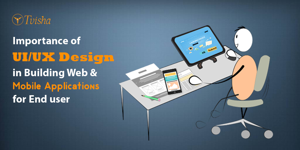
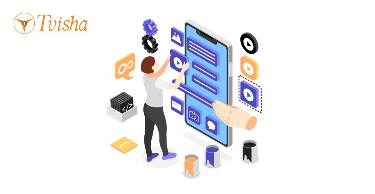
UI and UX Importance in Web and Mobile Applications
A few years into my career, a client sat across from me in a meeting and spent forty minutes debating whether a button should be teal or navy. Meanwhile, three screens over, users were abandoning the checkout flow at a rate that should have set off alarms in the building. Nobody in that room had looked at the actual drop off data. Everybody had an opinion about teal.
That meeting taught me more about the difference between UI and UX than any textbook did. The color of the button is UI. Whether a user can actually complete their purchase without getting confused, frustrated, or lost is UX. Both matter. But conflating them, treating "make it look nice" and "make it work well" as the same job, is one of the most expensive and common mistakes I've watched companies make over and over again in fifteen years of doing this work.
This article is my attempt to actually clear that up, properly, with the kind of detail and honesty that a topic this foundational deserves. Not a list of buzzwords. The real thing.
What UI actually is, and what it isn't
UI stands for user interface, and at its core it's everything a person sees and touches when they interact with your product. The buttons, the color palette, the typography, the icons, the spacing between elements, the layout of a screen. If you can point at it on the screen, it's probably part of the UI.
But here's what a lot of explanations get wrong: UI isn't just decoration layered on top of a functioning product. Good UI is a communication system. Every visual choice you make is either helping a user understand what to do next or getting in their way. A button that doesn't look clickable isn't a minor aesthetic miss, it's a communication failure. A form field with no visible label isn't stylistically minimalist, it's ambiguous, and ambiguity in an interface always costs you conversions, support tickets, or both.
I've worked with UI designers who think of their job as making things beautiful, and the good ones eventually learn that beauty in an interface is not the same as beauty in a painting. A painting can reward confusion, can ask the viewer to sit with ambiguity. An interface cannot. Every pixel on a screen your user is trying to accomplish something with needs to justify its presence by helping them accomplish that thing, or it needs to get out of the way.
What UX actually is, and how it's genuinely different
UX stands for user experience, and it's a much bigger, much less visible discipline than most people initially assume. UX is not what a screen looks like. UX is whether the whole journey, from the moment someone hears about your product to the moment they successfully use it and keep using it, actually works.
Here's an analogy I've used with dozens of clients over the years, and it still holds up. Think about a restaurant. The UI is the plating, the lighting, the menu design, the uniforms the staff wear. All of that matters, genuinely, it shapes how someone feels about the meal. The UX is whether the reservation system worked, whether the table was ready when promised, whether the waiter understood the order correctly, whether the food arrived in a reasonable time, whether the bill was clear, whether the whole evening left the person wanting to come back. You can have gorgeous plating and a genuinely broken UX if the reservation system loses bookings and the wait staff is confused about the menu. And you can have a beautifully functioning UX with fairly plain visual design, and people will still come back, because the thing simply worked.
A UX designer's actual job involves research (talking to real users, watching how they behave, not guessing), information architecture (deciding what content and functionality exists where, and why), interaction design (deciding how a user moves from step to step to accomplish a goal), and usability testing (actually watching people try to use the thing, and finding out where they get stuck, confused, or frustrated). None of that is visual design work in the traditional sense. A good UX designer could describe an entire product experience in a whiteboard diagram of boxes and arrows, with zero color or typography involved, and you'd understand exactly how it's supposed to work.
Why people confuse the two, and why the confusion actually costs money
I understand why UI and UX get conflated constantly. They're genuinely intertwined in the final product a user experiences, and a lot of designers, especially early in their careers, do both jobs simultaneously without fully separating the thinking. But the confusion has a real, measurable cost, and I've seen it play out the same way more times than I can count.
A company hires a talented visual designer, calls the job "UI/UX designer" because that's the industry norm, and expects that one person to also conduct user research, map information architecture, run usability tests, and think through edge cases in a complex checkout flow. Sometimes that works, if you've found a genuine unicorn who's deeply skilled at both. More often, the visual work happens (because it's the tangible, presentable deliverable that's easy to show a stakeholder) and the actual experience work gets skipped or rushed, because there's no dedicated time or budget for it, and because a beautiful mockup feels like progress even when nobody has tested whether real users can actually complete their goals with it.
I've walked into projects, more than once, where a full visual redesign had already happened before a single usability test was run. The result always looks the same: a gorgeous interface with the same fundamental usability problems the old version had, just wearing nicer clothes. The client is confused about why conversion didn't improve. The answer is almost always that the visual layer changed but the underlying experience, the actual flow a user has to navigate, didn't.
The principles of UI design, properly explained
Most articles on this topic list these principles as single words with no elaboration. That's not useful. Here's what each one actually means in practice, with real detail.
User control. Users need to feel like they're driving the interaction, not being driven by it. This means giving people an obvious way to undo an action, cancel a process partway through, or back out of a flow without losing their progress. I've seen apps that force a linear, unskippable multi-step onboarding with no exit, and the drop off rate on those flows is always brutal. People don't like feeling trapped, even in software.
Familiarity. Reinventing standard interface patterns for the sake of being different is one of the most common mistakes I see junior designers make. A shopping cart icon in the top right corner is familiar because it's been there, in roughly that spot, on a huge share of e-commerce sites for over a decade. Moving it somewhere unexpected doesn't make your product feel innovative, it makes users hunt for something that should have been instantly obvious. Save your creative energy for the parts of your product that are genuinely novel, and let the familiar conventions do their job everywhere else.
Clarity. Every element on a screen should have an unambiguous purpose that a first time user can identify without instruction. If you find yourself needing a tooltip to explain what an icon means, that's often a signal the icon itself has failed at its job. Clear labeling, clear iconography, and clear visual hierarchy do more for usability than almost any other single factor.
Hierarchy. Not everything on a screen is equally important, and your design needs to visually communicate that. Size, color, weight, and placement all signal importance. The primary action on a screen, the one thing you most want a user to do, should be visually unmistakable. I've reviewed screens with six equally weighted buttons and no clear primary action, and users on those screens genuinely hesitate, because the interface hasn't told them what matters most.
Accessibility. This deserves far more attention than a single bullet point, and I'll come back to it in detail later in this article, because it's become significantly more important, and legally consequential, in the last two years than it was even a short while ago.
Flexibility. Good interfaces accommodate different user needs, different devices, different contexts of use, without breaking. A design that only works at one exact screen size, or only for a user moving through the intended happy path with no mistakes, isn't actually finished. Real users have small phones, large monitors, slow connections, and they make mistakes. Your interface needs to hold up under all of that, not just the ideal scenario in your Figma file.
Beyond these six, I'd add one more that experienced designers know matters enormously and beginners often underweight: visual consistency across the entire product. A button that looks and behaves one way on one screen and differently on another screen doesn't just look sloppy, it actively erodes a user's trust that they understand how your product works. This is exactly why mature product teams build and maintain design systems, reusable, documented libraries of components and patterns, rather than letting every screen get designed from scratch. I'll talk more about why design systems have become genuinely central to serious UI/UX work in a moment.
The principles of UX design, properly explained
Same treatment. Here's what these actually mean, in practice, not just as a word list.
Consistency. Similar to visual consistency in UI, but broader: consistency in how interactions behave. If swiping left archives an email in one part of your app, swiping left shouldn't delete something permanently somewhere else. Users build mental models of how your product works based on early interactions, and violating those models later creates confusion and, often, real mistakes with real consequences, like a permanent delete where the user expected a reversible archive.
Hierarchy. In a UX sense, this is about information architecture rather than visual weight: what's the most important task a user needs to accomplish, and is your product structured so that task is the easiest one to complete? I've audited products where the core, revenue driving action was buried three menus deep, while a rarely used settings page sat prominently on the main navigation. That's a hierarchy failure, and it's not a visual problem, it's a structural one.
Confirmation. Users need to know that an action they took actually happened. This sounds obvious, but I still regularly find flows where a user submits a form, clicks a payment button, or deletes an item, and receives no clear confirmation that anything occurred. The result is users clicking the same button multiple times (sometimes resulting in duplicate orders or duplicate charges, which is its own support nightmare), or abandoning a process because they genuinely don't know if it worked.
User control. Same principle as in UI, but here it's about the flow of a whole process rather than a single screen. Can a user pause a multi-step process and come back later without losing their work? Can they go back a step without starting over entirely? These questions matter enormously for anything involving forms, applications, or checkout flows with real friction.
Accessibility. Again, coming back to this properly below, because it deserves it.
I want to add two more that I consider essential, even though they don't always make the shortlists: error prevention and graceful error recovery. The best UX doesn't just handle errors well, it prevents likely errors from happening in the first place, through smart defaults, inline validation, and clear formatting guidance before a user submits something wrong. And when an error does happen anyway, because it always eventually does, the recovery experience matters just as much as the prevention did. A form that clears all your entered data because one field failed validation is a design failure, full stop, and I still see this mistake in production software regularly.
What a genuinely well designed UX actually does for a business
Most articles list this as a bullet dump: increased satisfaction, better conversion, lower support costs, and so on. Those things are true, but listing them without explaining the mechanism behind each one is exactly the kind of shallow treatment that makes this topic feel like marketing copy instead of real expertise. Let me walk through the actual mechanisms.
Conversion improves because friction is the enemy of completion. Every extra field in a form, every unclear label, every moment of hesitation where a user isn't sure what happens next, is a point where some percentage of your users will simply leave. Good UX systematically removes those friction points. This isn't abstract, it's measurable: I've watched single field removals from checkout forms produce completion rate improvements that would take months of advertising spend to achieve through acquisition alone.
Support costs drop because a well designed product answers its own questions. Every support ticket that starts with "how do I..." or "why did this happen..." is, more often than not, a UX gap. The product didn't make the next step obvious, or didn't confirm an action clearly enough, or didn't explain an error in language a normal person understands. I've worked with support teams whose ticket volume dropped meaningfully after a redesign focused specifically on clarifying confusing moments in the product, not because the product gained new features, but because the existing features finally explained themselves.
Retention improves because a frustrating product quietly loses users who never complain. This is the one I think gets underestimated the most. Most users who have a bad experience don't file a support ticket or leave a review. They just quietly stop using the product and go somewhere else. By the time churn shows up in your metrics, the actual frustrating moments that caused it happened weeks or months earlier, and are extremely hard to trace back without deliberate usability research. This is exactly why user testing early and often is so much cheaper than discovering usability problems through your churn dashboard six months later.
Development and documentation costs drop because a consistent, well thought through product needs less explaining, inside and out. A product with a coherent design system and consistent interaction patterns is genuinely faster and cheaper to build new features for, because engineers and designers aren't reinventing decisions that should already be settled. It also needs less external documentation and help content, because a well designed interface teaches the user as they go.
What's genuinely changed in this field, and what hasn't
A lot of content on this topic hasn't been meaningfully updated in years, and it shows. Here's what's actually different about doing this work well right now.
Design systems have gone from a nice to have to genuine infrastructure. A decade ago, a design system was something only the largest tech companies bothered building. Today, any product team serious about consistency, speed, and quality maintains one, a documented, shared library of components, patterns, and rules that both design and engineering pull from. This isn't a UI nicety, it's the practical mechanism that makes the "consistency" principle I described above actually achievable at scale, across dozens or hundreds of screens, built by many different people over years. If you're evaluating a design partner or an internal team today, ask whether they build and maintain a real design system. The answer tells you a lot about how seriously they take long term product quality versus one off screen design.
Accessibility has moved from an ethical nice to have to a genuine legal and commercial requirement, especially if you touch European markets. The European Accessibility Act became enforceable in June of 2025, and enforcement has been actively ramping up through 2026, with formal legal notices, regulatory investigations, and real lawsuits already filed against major retailers in France, market surveillance underway in Sweden, and enforcement action confirmed in the Netherlands and Germany. This applies to any company selling covered products or services into the EU, regardless of where the company itself is based, and penalties in some member states reach into the hundreds of thousands of euros, with market withdrawal as an additional real consequence. I mention this not to be alarmist, but because it changes the calculus on accessibility work: it's no longer purely a values based argument, it's increasingly a compliance and market access argument, and enterprise buyers in 2026 are routinely asking vendors for accessibility documentation during procurement, not just as an afterthought.
Practically, this means designing with proper color contrast, full keyboard navigation, screen reader compatible markup and labeling, and clear focus states from the start of a project, not bolted on afterward. Retrofitting accessibility into a finished product is dramatically more expensive and time consuming than building it in from the first wireframe, and I say that from direct experience on both sides of that equation.
AI assisted and adaptive interfaces are real now, not speculative. Products increasingly personalize what a user sees based on their behavior, adjusting content, layout emphasis, and even navigation based on real usage patterns rather than a single static design serving every user identically. This is genuinely useful when done well, and genuinely creepy or confusing when done poorly. The UX discipline that governs this well is the same discipline that's always mattered: understanding what a user actually needs in the moment, rather than what's technically possible to show them. The technology changed. The underlying judgment required to use it well did not.
Motion and micro-interactions carry more communicative weight than they used to. A well designed transition, a subtle animation confirming an action succeeded, a loading state that manages a user's expectation of wait time, these aren't decorative flourishes anymore, they're functional communication tools, and users have gotten more sensitive to their absence. A jarring, motionless interface where things simply appear and disappear with no transition reads as unfinished or unpolished to a modern user, even if they couldn't articulate exactly why.
How I'd actually run a UI/UX process, and what I'd tell you to avoid
After fifteen years, here's the version of this process I actually trust, and the mistakes I still see teams make constantly.
Start with real research, not assumptions. Talk to actual users, or at minimum look at real behavioral data, before deciding what to build or redesign. I cannot count the number of projects I've seen where an entire redesign was based on internal stakeholder opinions about what users probably want, with zero actual user input. This is expensive guessing dressed up as strategy.
Map the experience before you design a single screen. Understand the full journey, every step a user takes, every decision point, every place they might get confused or stuck, before opening a design tool. Skipping this step is how you end up with beautiful screens that don't actually connect into a coherent, sensible flow.
Wireframe in low fidelity first, and get real feedback before investing in visual polish. It's dramatically cheaper to fix a structural problem in a rough black and white wireframe than in a fully polished, color complete mockup that a stakeholder has already emotionally invested in. I've watched teams resist structural feedback purely because too much visual work had already gone into a flawed layout, and nobody wanted to "waste" it.
Test with real people, early and often, not just once at the end. A single round of usability testing right before launch catches maybe a fraction of the problems that testing throughout the process would catch. Small, frequent tests with five or six users at each stage consistently outperform one large test at the finish line, because you're catching and fixing problems while they're still cheap to fix.
Build and maintain a design system if you're serious about the product's future. Even a lightweight one, a shared set of components, colors, and interaction patterns, pays for itself quickly once a product has more than a handful of screens.
Treat accessibility as a first class requirement from day one, not a final pass. It's cheaper, it's more thorough, and increasingly, depending on your markets, it's the difference between compliant and exposed.
The single biggest mistake I still see, after all these years, is treating UI and UX as an afterthought bolted onto a feature list, something to make the already decided functionality "look nice," rather than a discipline that should shape what gets built and how, from the very beginning of a project. The products that genuinely succeed, the ones people come back to without being nagged by marketing to do so, are the ones where someone thought carefully, from the start, about what the person on the other side of the screen actually needs, and how to give it to them without friction, confusion, or frustration.
That's the whole job, honestly. Everything else is detail.
If you're building or rebuilding a product and want that thinking applied from the start, that's exactly the kind of work a genuine UI Design Company and a genuine UX Design company should be doing together, not as two separate afterthoughts but as one coordinated discipline, and it's just as essential whether you're building for the web or working with a Mobile App Development Company on something that lives on a phone.
Frequently Asked Questions
What is the actual difference between UI and UX design? UI is what a user sees and interacts with directly: buttons, colors, typography, layout. UX is the entire experience of using a product to accomplish a goal, including research, information architecture, interaction flow, and usability. A product can have beautiful UI and still fail badly on UX if the underlying experience is confusing or frustrating.
Is UX design more important than UI design? Neither is more important, they solve different problems and a serious product needs both done well. A gorgeous interface on top of a confusing experience will still lose users, and a smooth, logical experience with weak visual design will feel unpolished and untrustworthy. The two disciplines need to work together, not compete for priority.
How does accessibility affect UI/UX design in 2026? Significantly more than it used to. Beyond the ethical case, which has always mattered, the European Accessibility Act became enforceable in June 2025 and enforcement has intensified through 2026, with real regulatory action and lawsuits already underway in several EU countries. Any company selling products or services into EU markets should be treating accessibility as a compliance requirement, not an optional enhancement, and building it in from the start of a project rather than retrofitting it later.
What is a design system, and why does it matter for UI/UX? A design system is a shared, documented library of components, patterns, and rules that design and engineering both use to build a product consistently. It matters because it's the practical mechanism that keeps a growing product visually and behaviorally consistent across many screens and contributors over time, and it significantly speeds up and cheapens future development once it's in place.
How do I know if a redesign will actually improve my product's UX, not just its appearance? Real usability testing before and after, ideally with the same tasks given to real users in both versions. If a redesign changes visual style without addressing the actual structural or flow problems users were struggling with, conversion and satisfaction often stay flat or even decline, despite the product looking noticeably better. A redesign should be driven by research into what's actually breaking down for users, not by aesthetic preference alone.
Whatsapp
Email